CVS Health redesign
A redesign for the CVS Health mobile application to enhance user experience and engagement.
Elevating User Experience: The CVS Mobile App Redesign
Our innovative design solutions enhance user experience and engagement, driving customer satisfaction. With a focus on both aesthetics and functionality, we help your brand stand out in a competitive market.
Project Overview
Role and Team: I worked and communicated closely with my mentor. My role involved both UX design and research, with a focus on updating the profile dashboard for native iOS and Android applications. This included redesigning screens for Data Privacy, Profile, Sign-In and Security, Addresses, and Communication Preferences.
Role
UX Design/UX Research
Team
2 UX Designers
Timeline
Overall: 8months
Discovery & Research: 4+ weeks
Design: 7 weeks
Tools
Figma
Rally
Mobbin

Old profile and sign-in and security screens
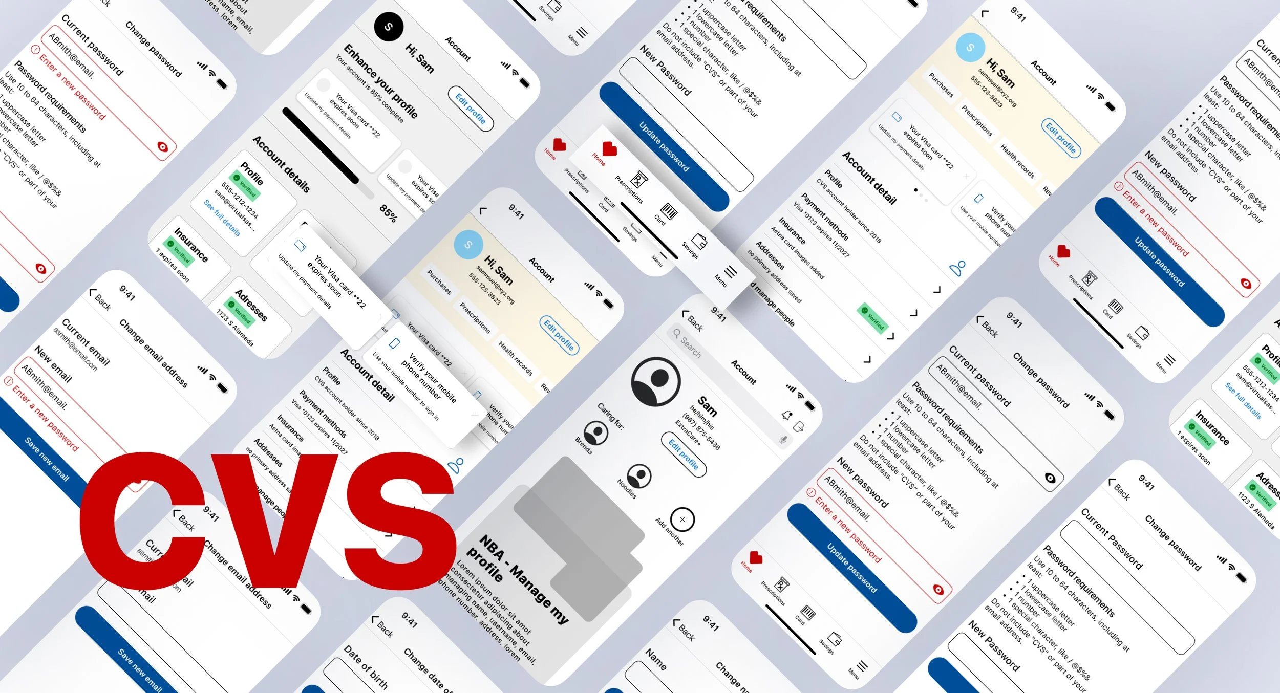
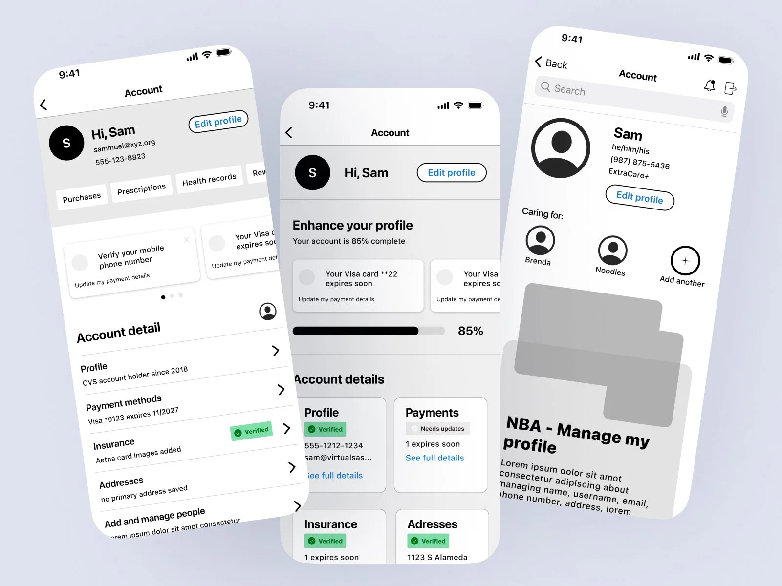
Building a super app our plans were to redesign the current account screen with our new UI kit and simplifying design and user flow based on research gathered from users.
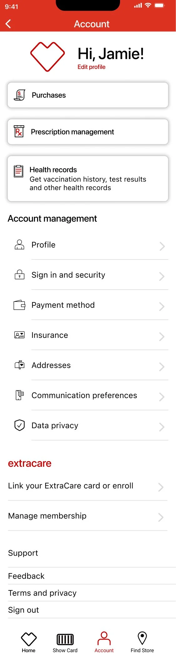
An old account screen
Collaborative Efforts and Focus Areas
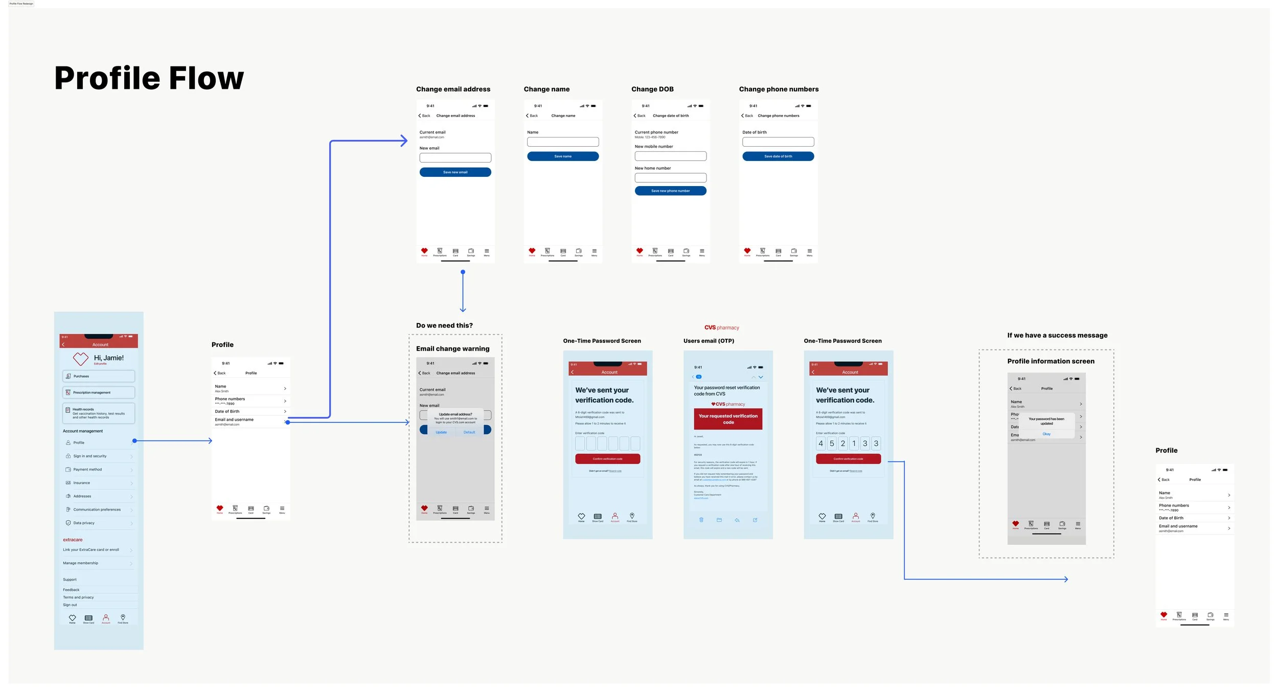
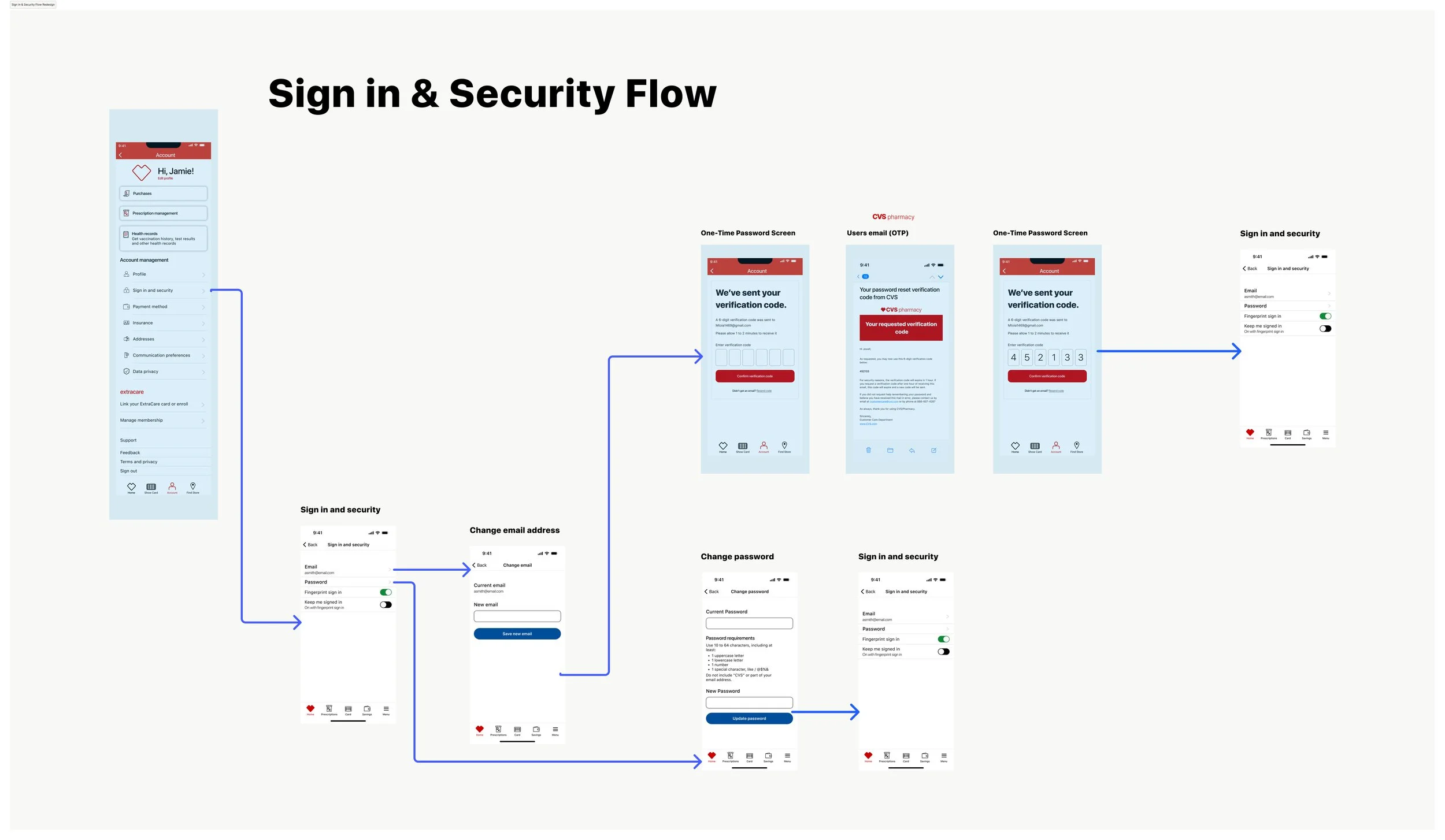
We aimed to involve other teams in shaping the direction of this work. This redesign was significant as it would be our first major overhaul, including the addition and removal of lines of business from the account screen. Consequently, collaboration with various teams was crucial. Meanwhile, I concentrated on the connecting screens under the Account Management category: Profile, Sign-In and Security, Address, Communication Preferences, and Data Privacy.
The Goal: Enhance app security and improve the overall user experience.
The Challenge: The existing sign-in process was cumbersome, and the security features were outdated, affecting user trust and ease of use. Issues included web-framed sign-in and security pages, a multi-step password update process, and ambiguous terminology such as "Edit" and "Remember Me."
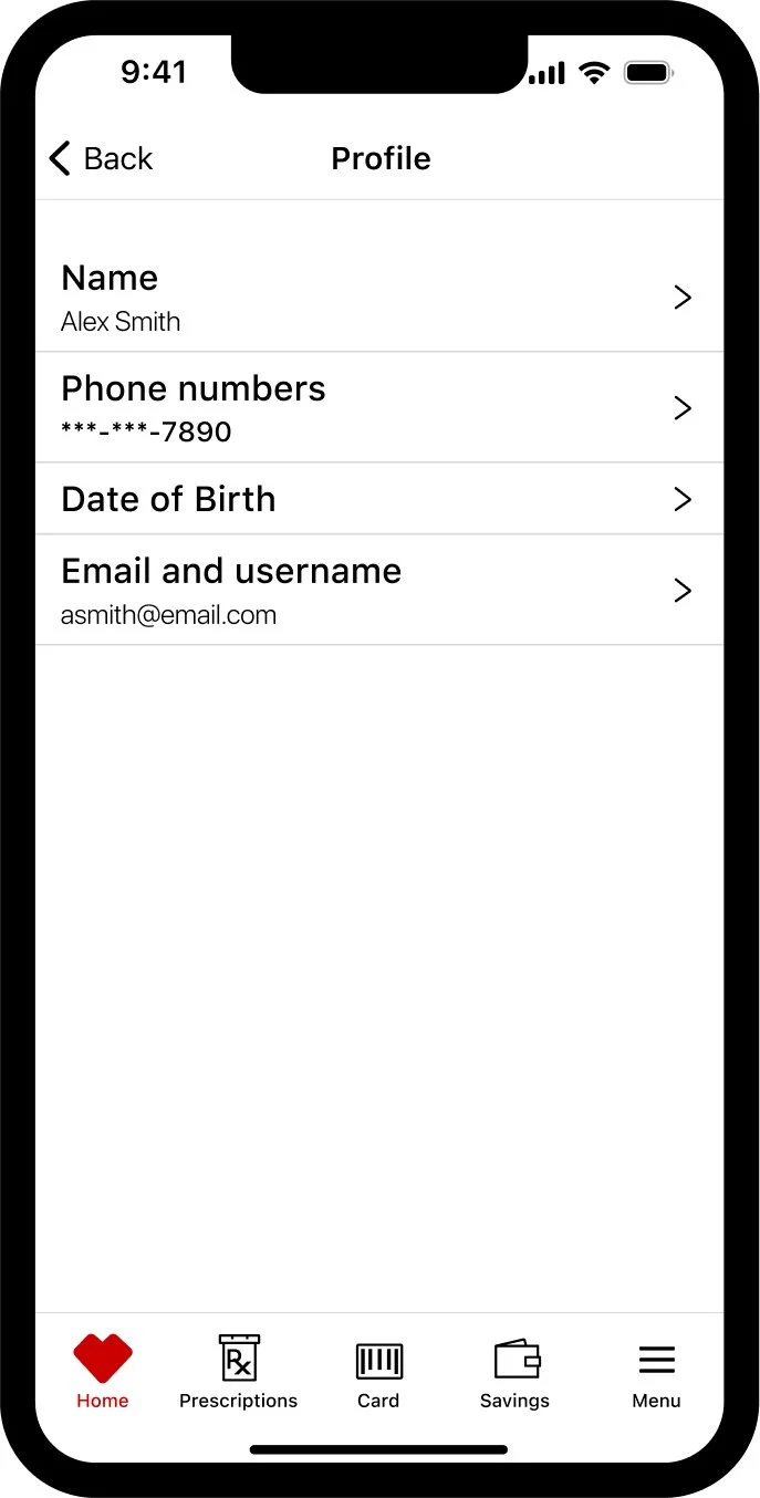
Redesigning the Profile Dashboard
Design Showcase


User Insights
Through user feedback we identified the main pain points:
Cluttered Interface
Confusing Navigation
Inconsistent Design Elements
Inefficient Flow
Key Objectives
Transition sign-in and security pages from web frames to native app pages for a smoother experience.
Replace the "Remember Me" option with "Keep Me Signed In" to clarify its functionality.
Change the term "Edit" to "Change" to simplify the process of updating information.
Use email addresses instead of usernames for signing in, making it easier for users to manage their login details.
Remove security questions and consolidate the password update process into one screen.
Design Transformations
Simplified Interface: Prioritized essential elements and used ample whitespace to create a clean and modern look.
Intuitive Navigation: Improved navigation with clear pathways and shortcuts.
Consistent Design Elements: Developed a unified style guide for a cohesive and professional appearance.
Efficient Flow: Streamlined the process for updating profile information and security settings.

User-Centric and visual style
User-Centric Approach: We adopted a user-centered design (UCD) approach, focusing on empathy and user needs. Iterative usability testing was conducted to validate design choices and gather feedback for informed adjustments. Both qualitative and quantitative research methods were utilized to ensure a comprehensive understanding of user requirements.
Visual Style: The updated CVS mobile application featured a clean and modern aesthetic, enhancing user experience through simplicity and elegance. We adhered closely to Apple's Human Interface Guidelines (HIG) and Google's Material Design principles to maintain cohesive and user-friendly designs across both iOS and Android platforms.
Final wireframe after cross team alignment
Below the Account details you will see a native list where the various navigation links for Address, communication preferences, data privacy and so on.
Project Reflection and Future Insights
Working on the CVS mobile application redesign was a significant and enriching experience. It was rewarding to see the transformation from an outdated interface to a modern, user-friendly design. This project not only improved my technical skills but also enhanced my ability to adhere to strict guidelines and iterate designs with the user in mind.
Key Learnings:
User Experience Importance: Understanding the crucial importance of user experience.
Thinking Like a Developer: Learning to think like a developer to facilitate better collaboration.
Understanding UI Kits and Components: Gaining a deep understanding of UI kits and components significantly improved my design process.
Thank you for reading my case study!
Want to work with me? Feel free to contact me! ...or just say hello on Linkedin.